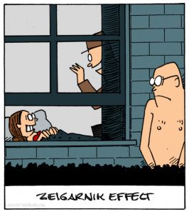
This is the first cartoon that I’ve drawn for “the Bias project”. According to Wikipedia, the Zeigarnik effect is: “The effect that people remember unfinished uncompleted or interrupted tasks better than completed tasks”

Actually, it is rather a good one to start this project with. Why? Because this is the main reason why companies hire UX designers. Our task is to design complete experiences, from the beginning till the end. But that experience is meant to be a unconscious one. We want to enable customers to perform their tasks with ease, without having to think (yes, thank you, Steve Krug). And when they’ve completed their task, they can forget about it.
If we’ve got the flow wrong, the experience will be interrupted and the Zeigarnir effect kicks in: people wíll remember and it won’t be a happy memory. It may even start its own life online as a complaint. Therefore: aim for design that can be experienced, not remembered.