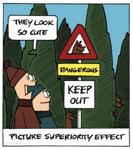
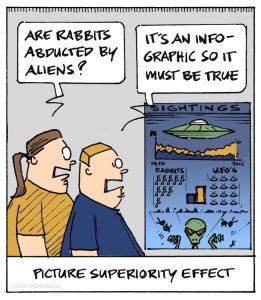
The picture superiority effect is the notion that: “Concepts learned by viewing pictures are more likely to be remembered than their counterparts written in words”

The picture superiority effect is a memory bias but of course it has a lot to do with learning values as well. It’s what sticks in the mind that counts, isn’t it? Images shape our perception. When we think about bears, we do not think about gruesome grizzlies lurking in the forest; we think about Winnie the Pooh and Paddington. If you want to impress, use images.
Images play directly on our emotions but only if they have information value for the customer, they have to be part of the story. Sometimes that’s easy. If you want to buy a phone online, pictures of the product will tell you a lot more than product specifications (or do you know how big 4,7 inch is?).

But sometimes it’s a lot harder; what does ‘excellent service’ look like? You really need a compelling, more personal story before you’ll know how to visualize such a concept. Otherwise, you’ll end up using a stock photo that will tell people only one thing: ‘we’re the same as everybody else’.
So as an UX designer: always know the story before you design the concept. Only then let the image do the talking.